

 For over 8 years now we have been developing and designing Wild Apricot websites and themes. We want to share some insight, but first let me present you with some of the internal logic for us undertaking this approach:
– We Love Wild Apricot users and their organizations
– We prefer to work with the Wild Apricot Membership & Events CMS over all others
– The level of care that goes into this platform is almost unheard of in this day and age of SaaS.
As I was saying, when we took a long hard look at the Wild Apricot client requirements list we noticed a recurring theme. Here are the main key items our clients are asking for when it comes to the design and development of custom or refined Wild Apricot themes:
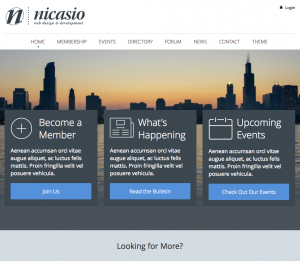
1- Clear Logo placement
2- Login button that is unobtrusive
3- A large visual representing of the organization
4- Three easy to edit and strategically placed calls to action
5- Follow the eye below the fold and give them more actions
6- Learn More about the parent organization without taking up space
7- A very basic footer and footer navigation with Social Media Icons / Links
A little more details will help point out what we came up with. If you have not seen Nicasio Design’s resale themes – please visit this link and click on theme links under the heading ‘ANNOUNCING CUSTOM WILD APRICOT THEMES!’ Our most popular theme is Nicasio Wild Apricot Theme 2 and the test subject of this post.
Now for the details:
1- Clear Logo placement; We felt that the industry standard or best practice for logo placement is top left nav. Our research revealed that “placement definitely does matter, at least if you want users to actually remember your brand. People were significantly more likely to remember the name of [your organization] when the logo had been positioned in the top left corner of a website, compared to in the top right corner.” Src: nngroup.com
2- Login button that is unobtrusive; This is one almost self explanatory right? Though traditionally most websites present the UID/PW login fields by default, there is nothing wrong with having the user go one level deeper to perform such action and thus saving the rest of the world your call to action which may not apply to all. Not to mention the use of resources each time someone attempts to login to the site. An advanced feature is to drop down the login boxes on click without taking the visitor to another page.
3- A large visual representing of the organization; In other words, precise useful and visual representation of your organization central to the website’s sweet spot. This visual presentation sets the mood for your website and is most importantly the very first impression on the user of your organization. If a slider with multiple images, we typically suggest no more then 3 to 5 images as to not overwhelm the visitor.
4- Three easy to edit and strategically placed calls to action; With a limited time [in seconds] to engage your visitors, we thought [as well as most clients] that 3 calls to action would engage the visits as well as trigger at least one click trough per 10 visitor. Example… if you go to the NetFlix website and do not move the page after it fully loads – what do you notice? 3 things; Login, join, the brand logo. That’s it, and that is perhaps one of the most effective landing pages on the web today. The 3 default actions we suggest are – Join the organization, News/What’s Happening, and browse Events.
5- Follow the eye below the fold and give them more actions; So what happens once the user lands on your homepage, notices your brand, calls to action and large visual impact? What if he is there for more than just these things? Well, below the fold we take the opportunity to help you anticipate the visitor’s intentions by providing him with 4 new options; Find Benefits aka why join, Find Resources, Get Involved/Support/Donate, and Contact you if all else fails.
6- Learn More about the parent organization without taking up space; One of the greatest challenges for a website’s homepage is to provide the right amount of information, OR the ability for a visitor to quickly find what he is looking for. To Learn about your organization can a simple LEARN MORE button work? According to smashingmagazine.com there are a few tips to making this happen effectively; Contrasting Buttons, Use of White Space, and Identifying the Secondary Action. In other words, this is as effective as effective gets.
7- A very basic footer and footer navigation with Social Media Icons / Links; I like what our lead developer says about side bars and footers… “The Footer is NOT a Christmas tree!” We feel that the footer is a place where the visitor can find a navigation matching the top nav, and not get lost in space [queue Lost in Space theme song] If you’re familiar with the song, think for a moment how it makes you feel? Note this is NOT how you want your website visitors to experience your website either right?
Contact Us. Want to connect with us about a project? Great! Email us at info@nicasiodesign.com or visit our website and fill out the contact form. We promise to reply within 24 hours, or instantly many times. Once we connect, we can discuss your project details/scope and provide a quote ASAP.
If you’ve been feeling too much like a robot lately, feel free to give us a call at (912) 292-1716 9AM – 7PM EDT for some 1-on-1 time!