
If your association website feels hard to update, confusing for members, or out of step with your brand, a redesign is usually not just a design problem. It is a performance problem. Knowing how to redesign association website experiences starts with understanding what the site needs to do better for members, staff, sponsors, and prospective members, then rebuilding around those priorities instead of decorating the old problems.
A lot of association teams begin with the homepage mockup. That is understandable, but it is rarely the right first move. The stronger approach is to treat the redesign like an operational project with clear business goals. If your members cannot register easily, renew dues without friction, find events, access resources, or update their profiles, the website is not supporting the organization the way it should.
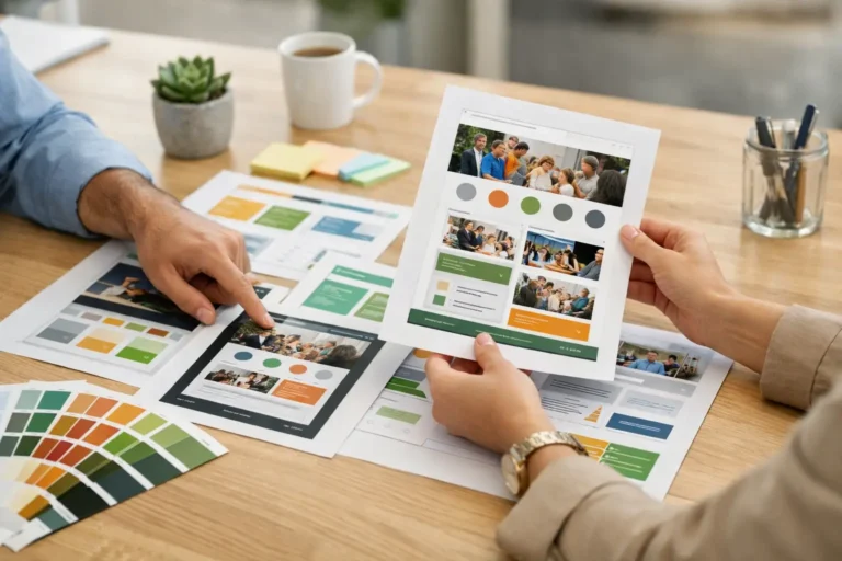
How to redesign association website strategy before design
The best redesigns begin with a simple question: what is underperforming right now? For some associations, the issue is branding. The site looks dated and no longer reflects the credibility of the organization. For others, the real problem is functional. The member directory is weak, event registration is clunky, staff workflows are too manual, or the site is split across too many systems.
This matters because the redesign plan changes depending on the problem. If the site is visually old but functionally sound, the project may focus on user experience, mobile responsiveness, and content clarity. If the platform itself is holding the organization back, the redesign may need a deeper rebuild with custom templates, better integrations, or a new CMS.
Before any design work starts, define a short list of measurable goals. That might include increasing membership applications, improving event registrations, reducing support emails, speeding up content updates, or making the member portal easier to use. A redesign without measurable goals tends to drift into preference-based decisions, and those projects get expensive fast.
Audit what members and staff actually use
Association websites serve multiple audiences at once. That is what makes them different from a standard small business site. You are not just speaking to prospects. You are supporting current members, board members, event attendees, sponsors, and internal staff.
That complexity makes a content and feature audit essential. Review the pages people visit most, the forms they use, the resources they download, and the actions they struggle to complete. Look at analytics, but also talk to staff. They usually know where users get stuck because they see the support requests every week.
This is also the stage where unnecessary content should be cut. Many association websites have years of outdated committee pages, duplicate documents, expired event information, and navigation items added to satisfy internal requests. A redesign is the right time to simplify. More pages do not create more value if they make the site harder to use.
Fix the structure before the visuals
A polished design cannot rescue weak site architecture. If the navigation is cluttered or the page hierarchy is unclear, members will still feel lost even if the site looks modern.
Start by organizing the website around top user tasks. For most associations, that includes joining, renewing, logging in, registering for events, finding member benefits, accessing resources, and contacting the organization. These actions should be easy to find from any device.
There is often a trade-off here between internal structure and user-friendly structure. Staff may think in terms of departments, committees, or administrative categories. Members usually think in terms of tasks. The redesign should favor the member’s perspective. That does not mean every internal need disappears, but it does mean public navigation should be simpler than the org chart.
Wireframes help here because they keep the team focused on layout and content priorities before visual design enters the conversation. This reduces subjective feedback and keeps discussions practical.
Choose the right platform for the association model
Platform decisions shape the success of the redesign more than many teams expect. If your association runs on Wild Apricot, for example, the redesign needs to respect how membership management, event registration, payments, and member access work inside that platform. If you are using WordPress with third-party membership tools, the planning needs to account for plugin dependencies, admin usability, and long-term support.
There is no one perfect platform for every association. It depends on your size, budget, internal technical comfort, and how complex your member experience needs to be. Some organizations need a highly customized setup. Others need a cleaner, better-branded version of what they already use.
The mistake is assuming the redesign is only a front-end project. In practice, back-end workflows matter just as much. If staff cannot manage the site efficiently after launch, the redesign will feel like a short-term win and a long-term burden.
Redesign around member experience, not just appearance
When people ask how to redesign association website projects successfully, they often mean, how do we make it look better? The better question is, how do we make it easier to use?
For members, good experience usually comes down to speed, clarity, and trust. They should know where to click, what they will get, and what to do next. Registration flows should be short. Calls to action should be obvious. Forms should ask for what is necessary, not everything the database might like to store.
Mobile experience matters more than many associations assume. Event signups, email clicks, donations, and quick member logins often happen on phones. If key actions are frustrating on mobile, conversion drops even if the desktop site looks strong.
Trust also shows up in smaller details. Consistent branding, current event information, updated staff contacts, clear membership value, and fast load times all signal that the organization is active and professionally run.
Use content to support decisions
A redesign is the right moment to rewrite weak content. Many association websites rely on internal language that makes sense to staff but not to visitors. Membership categories may be explained poorly. Benefits may be listed without showing value. Program pages may describe activities without making the next step clear.
Good redesign content is plainspoken and specific. It helps prospective members understand why they should join. It helps current members find what they already pay for. It helps sponsors see the audience they can reach. And it helps staff spend less time answering avoidable questions.
This does not mean every page needs marketing polish. Some pages simply need cleaner headings, better structure, and fewer words. Others need stronger messaging because they directly affect conversions. Homepages, membership pages, event pages, sponsor pages, and donation pages usually deserve the most attention.
Plan for data, integrations, and migration early
This is where many redesigns get delayed. Associations often have member records, event history, gated resources, payment tools, forms, and email systems that need to work together. If those dependencies are ignored until late in the project, surprises show up during launch.
Map the critical systems early. Identify what content needs to move, what can be archived, what integrations must stay, and what should be replaced. If there are member-only resources, profile fields, or custom workflows, document them before design and development move too far ahead.
It also helps to decide what success looks like after launch. Track renewal conversions, event registrations, contact form completions, page speed, search visibility, and support request volume. A redesign should improve performance, not just perception.
Build for support after launch
A website redesign is not finished when the new site goes live. Associations need updates, troubleshooting, content changes, and platform-specific support over time. That is why partner selection matters as much as the design itself.
The right partner should understand the platform, the association model, and the practical realities of internal teams that do not have time to manage five vendors. Nicasio Design has built long-term client relationships around that exact need: replacing underperforming websites with stronger designs, better functionality, and dependable support after launch.
That ongoing support matters because your site will keep evolving. New programs launch. Events change. Member expectations shift. Staff roles turn over. A redesign should leave your association with a site that is easier to manage, not one that becomes outdated the moment the project closes.
A good association website does not need to be flashy. It needs to be clear, credible, and useful. If your redesign helps members complete key actions faster and helps your team manage the site with less friction, you are not just refreshing the website. You are improving how the organization works online.