

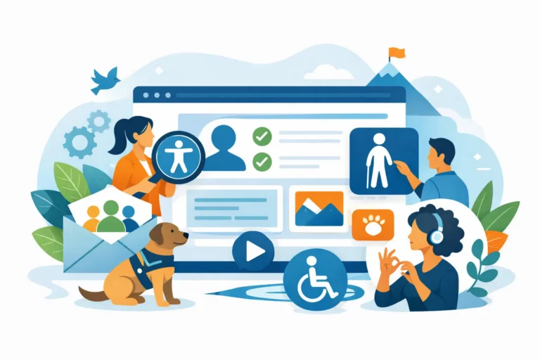
A member arrives to renew, register for an event, or download a resource. If they cannot use the navigation without a mouse, read the event details with a screen reader, or complete a payment form because the error message is unclear, the experience ends there. Website accessibility is not a side project for membership organizations. It is part of serving the community you exist to support.
For associations, nonprofits, chambers, and professional societies, an accessible website also reduces avoidable support requests. When essential tasks are clear and usable for more people, staff spend less time troubleshooting registrations, explaining forms, and responding to frustrated members.
What website accessibility means in practice
Website accessibility means designing and building a site so people with disabilities can perceive, understand, navigate, and complete tasks on it. This includes people who use screen readers, keyboard-only navigation, voice controls, magnification tools, captions, or other assistive technology. It also helps members facing temporary limitations, slow connections, bright sunlight, aging vision, or an unfamiliar device.
Accessibility is often discussed as a compliance issue, and legal risk can be a valid concern. But treating it only as a checklist misses the bigger opportunity. A readable, well-organized, predictable website is simply easier for every member to use. That supports credibility, participation, event attendance, and renewal activity.
The Web Content Accessibility Guidelines, usually called WCAG, provide the best-known framework for evaluating a site. They cover areas such as color contrast, keyboard access, headings, images, forms, and media. The right target and level of review can depend on your organization, audience, resources, and legal guidance. The practical goal is to make the member journey work for as many people as possible, then maintain that standard as the site evolves.
Why accessibility matters for member experience
Membership websites ask visitors to do more than read a brochure. They join, renew, sign in, update profiles, purchase tickets, make donations, find local chapters, and access member-only resources. A small barrier in any one of those steps can prevent someone from completing an action that matters to both them and your organization.
Consider an event registration page with required fields identified only by red text. A member who cannot distinguish that color may not understand what needs attention. Or consider a menu that opens only when someone hovers over it. A visitor using a keyboard may never reach the page they need. These are not unusual technical edge cases. They are common usability failures with direct consequences.
Accessible design also reinforces trust. Members judge an organization by the care it shows in its communications and services. When the website feels confusing, difficult to read, or inconsistent, it can make an otherwise respected organization appear less prepared or less welcoming.
Where membership websites most often fall short
Many accessibility issues are introduced gradually. A staff member uploads a PDF exported from an old document. An event image is added without meaningful alternative text. A new button color is selected because it matches the brand palette, but its contrast is too low for readable text. None of these decisions may seem significant alone. Together, they create friction across the site.
The highest-impact areas are usually the pages where members take action: navigation, membership applications, renewal and donation forms, event registration, login, and payment. A homepage can look polished while the actual conversion path remains difficult to use.
Four areas deserve early attention:
- Keyboard navigation: Every menu, button, form field, modal window, and interactive element should work without a mouse. Users need to see where their keyboard focus is as they move through a page.
- Clear page structure: Headings should describe the content that follows and appear in a logical order. This helps screen reader users move through long pages efficiently and helps all visitors scan information.
- Forms and error messages: Fields need visible labels, clear instructions, and specific error messages. Telling someone that a form has an error is less helpful than identifying the field and explaining what to correct.
- Readable visual design: Text needs sufficient contrast against its background, and important information should not rely on color alone. Font size, spacing, and button labels should support quick reading and confident action.
Images and documents require attention as well. Decorative images generally do not need descriptive alternative text, while images that communicate information do. A chart, sponsor graphic, or photo used as a link should have text that explains its purpose. PDFs should be treated as published web content, not as an afterthought. If a document is essential to joining, registering, or understanding a policy, it needs an accessible format.
Accessibility in Wild Apricot needs a practical approach
Wild Apricot gives membership organizations valuable tools for memberships, events, payments, email, directories, and member self-service. It also introduces a reality that organizations need to plan around: some elements are controlled by the platform, while others are shaped by your theme, page content, custom code, and ongoing staff updates.
That distinction matters. Not every accessibility issue has the same solution. A problem in custom navigation or a page layout may be addressed through thoughtful theme customization. A limitation inside a platform-managed feature may require a different workflow, a content adjustment, or a review of available platform settings. The goal is not to force a workaround that creates a new problem. It is to understand what is within your control and make smart improvements where they will have the most impact.
For example, a well-designed Wild Apricot theme can establish accessible heading styles, visible focus states, readable colors, logical navigation, and consistent button treatments across the site. Staff can then maintain those standards more easily when publishing news items, creating event pages, or adding resources. Good implementation reduces the number of decisions each person has to make correctly under time pressure.
It is also wise to test the full journey, not just individual pages. Can a prospective member find membership levels, compare benefits, complete an application, and receive confirmation? Can a returning member sign in, renew, and update their profile? Can an event attendee select a registration option and finish payment? These are the workflows that determine whether the website is doing its job.
How to improve website accessibility without overwhelming your team
A full accessibility review can reveal a long list of issues. That does not mean your team needs to fix everything at once. For organizations with limited staff, the best approach is to prioritize barriers by impact.
Start with the tasks that affect revenue, participation, and essential member services. Review your main navigation, membership and event paths, contact forms, login process, and most-used documents. Then address recurring design and content patterns that can improve many pages at once, such as heading styles, link text, buttons, and color combinations.
Manual testing is essential because automated tools cannot tell you whether a form instruction makes sense, whether a link label is meaningful, or whether a keyboard user can understand a complex menu. Automated scans are useful for finding obvious code-level issues, but they are a starting point rather than proof that a site is accessible.
Bring the people who update the website into the process early. A site can launch in good shape and drift quickly if editors do not have a clear process for adding alternative text, choosing headings, formatting documents, and checking links. Simple publishing guidelines are more sustainable than relying on one person to remember every requirement.
Accessibility is an ongoing website responsibility
A website is never static, especially for a membership organization. New events, changing dues, board announcements, sponsor promotions, policy documents, and annual campaigns all introduce new content. Accessibility needs to be part of that regular publishing rhythm.
That does not require turning staff into technical specialists. It requires clear standards, reliable templates, and periodic reviews of the places where members are most likely to get stuck. A trusted website partner can help assess the site, prioritize improvements, and make sure design updates support both your brand and your operational goals.
Nicasio Design approaches this work with the reality of membership organizations in mind: your team has limited time, your website must work with Wild Apricot, and every improvement should make the site easier to manage as well as easier to use. The strongest accessibility decisions are the ones that continue helping staff and members long after launch.
A more accessible website begins with one useful question: can every member complete the next important task without needing extra help? Let the answer guide what you improve first.