

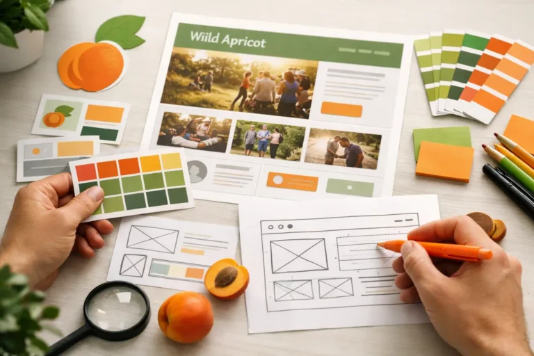
A Wild Apricot site can handle memberships, event registration, donations, and member-only content effectively, yet still look like it belongs to any organization. That disconnect is usually what prompts teams to ask how to customize Wild Apricot themes without disrupting the tools members rely on. The goal is not decoration for its own sake. It is a clearer, more credible member experience that supports the work your organization is already doing.
Wild Apricot gives associations, clubs, and nonprofits a useful operating system. Theme customization gives that system a public-facing identity. Done well, it makes the site easier to use, more aligned with your organization’s reputation, and more likely to guide visitors toward joining, registering, donating, or renewing.
Start With the Member Journey, Not the Theme Picker
The fastest way to create a disappointing redesign is to choose colors and fonts before identifying what visitors need to accomplish. A membership website has several audiences with different priorities: a prospective member may need to understand the value of joining; an existing member may need to renew or update a profile; an event attendee may need to register in a few clicks.
Before changing a theme, review the paths people take through the site. Look closely at your homepage, membership levels, event listings, donation pages, login area, and contact page. Identify the pages that generate the most questions or abandonment. Those are the pages where design improvements will have the strongest impact.
This matters because Wild Apricot themes affect more than the homepage. A style choice that looks polished in a static banner may make event registration forms, directory listings, or member controls harder to read. The best customization work treats branding and usability as one decision.
Choose a Theme for Structure, Then Customize It
When deciding how to customize Wild Apricot themes, begin with a base theme that is close to your intended page structure. Look at header behavior, navigation placement, sidebar options, page width, mobile presentation, and available content areas. It is usually more efficient to start with a theme that has the right structural foundation than to force a visually appealing theme to do something it was not designed to do.
A theme should support your organization’s content, not compete with it. For example, a professional association may need a clear navigation system and room for education, advocacy, and member benefits. A community club may benefit from a more event-focused homepage with a prominent calendar and welcoming imagery. A nonprofit may need donation calls to action that remain visible without overwhelming its mission content.
Avoid making the selection based on a theme preview alone. Add representative content before committing to the direction. Test a long event title, a multi-level membership description, a full-width photo, a member directory result, and a registration form. Real content reveals spacing and hierarchy issues that a clean demo cannot.
Build a Practical Visual System
Strong Wild Apricot customization starts with a small, repeatable design system. You do not need dozens of colors or font treatments. In fact, too many style choices make sites harder to maintain when staff members update pages later.
Set a primary brand color for major calls to action and key navigation states. Add one secondary color for emphasis, and use neutral shades for backgrounds, borders, and body text. Make sure button text and links have enough contrast to be readable, especially on mobile devices and for visitors with low vision.
Typography deserves the same discipline. Use a readable body font, a consistent heading treatment, and a sensible scale between headings, subheadings, and paragraph text. Overly small copy, light gray body text, or decorative fonts can make a site feel less trustworthy even when the rest of the design is polished.
Photography and graphics should reinforce the organization’s purpose. Member organizations often have a valuable advantage here: authentic images from events, programs, volunteer activities, or community gatherings. Use them. Generic stock imagery can fill a gap, but it rarely communicates belonging as effectively as real people participating in your organization.
Customize the Pages That Drive Action
Not every page deserves the same amount of design attention. Focus first on the pages where visitors decide whether to take action.
Make the Homepage Earn Its Place
Your homepage should quickly answer three questions: who is this organization for, what value does it provide, and what should the visitor do next? A concise opening message, a credible image, and one clear primary action often outperform a crowded carousel or a long block of introductory text.
Use the rest of the page to support that decision. Feature upcoming events, key membership benefits, recent resources, testimonials, or mission-related outcomes. Keep each section purposeful. If a homepage section does not help someone join, engage, attend, donate, or understand your organization, it may not belong there.
Clarify Membership and Renewal Paths
Membership pages should make levels, pricing, eligibility, and benefits easy to compare. Do not bury the join button beneath a broad history of the organization. That story may be valuable, but it should not prevent motivated visitors from taking the next step.
For existing members, make login and renewal options easy to find. A common issue on membership sites is giving significant attention to recruitment while making routine member tasks feel hidden or confusing. Both audiences matter. A well-customized theme uses navigation and visual hierarchy to serve each one.
Keep Event Registration Focused
Events are often one of the highest-traffic areas of a Wild Apricot website. Give event pages enough visual structure to make the date, location, price, audience, and registration status immediately clear. Supporting details can follow, but the practical information should be visible without extensive scrolling.
Be careful with custom styling around registration controls. A button may look better after CSS changes but become difficult to tap on a phone or blend into the background on a confirmation page. Attractive design only works when it remains functional across the entire registration process.
Use Custom CSS Carefully
Wild Apricot’s built-in settings can cover many common adjustments, including colors, fonts, layouts, headers, and content gadgets. Custom CSS is useful when the standard controls cannot achieve the spacing, alignment, responsive behavior, or component styling you need.
CSS should be used with restraint and documentation. Small targeted rules are easier to maintain than a large collection of overrides added over time. Name and organize styles clearly, and keep a record of why each major customization exists. Otherwise, a future theme adjustment can turn into a costly troubleshooting project.
It also helps to distinguish between a cosmetic request and a platform limitation. CSS can change how many interface elements look, but it cannot reliably redesign every built-in function or alter the underlying workflow. If a requirement involves custom member profiles, complex permissions, unusual registration logic, or a distinct user experience, it may require more than theme styling.
This is where experienced Wild Apricot support can save time. Nicasio Design helps organizations determine whether a request is best handled through theme settings, custom CSS, a redesigned page structure, or a more tailored technical solution. That assessment prevents teams from investing in a workaround that becomes fragile later.
Test the Whole Experience Before Publishing
A new design is not ready because the homepage looks right on one desktop browser. Test the full experience using a phone, tablet, and desktop screen. Check navigation menus, login controls, forms, event registration, member-only pages, payment and donation paths, confirmation messages, and email-related calls to action.
Use real or representative accounts where possible. An administrator sees a site differently from a nonmember, a pending member, or a logged-in member with renewal due. Permissions and system-generated content can change what appears on the page, so testing only as an administrator leaves important gaps.
Pay special attention to content changes. A theme may look excellent with carefully edited sample text but break when a staff member posts a long event title or uploads an image with an unusual crop. Establish basic editorial guidelines for image dimensions, heading use, and call-to-action wording so the design stays consistent after launch.
Plan for Maintenance, Not Just Launch
Theme customization is not a one-time project. Membership offerings change, events evolve, staff turns over, and platform updates can affect custom code. A well-managed site needs a clear owner, a process for making changes, and occasional reviews of the pages that matter most.
Keep a simple record of brand settings, CSS additions, custom content blocks, and approved page layouts. Train the people who update the website on what they can safely change and what should be reviewed first. This protects the investment in the redesign while keeping routine updates manageable.
The right Wild Apricot theme should make your organization look established and make member tasks feel straightforward. Start with the journeys that matter most, customize with purpose, and keep the system maintainable. Your members may never notice the code or the theme settings, but they will notice when the website makes participation easier.