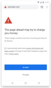
 Google will begin warning users on Chrome 71 [by Decv 2018] if a payment or subscription page is unclear. See full article here.
The article points out that “Every month, millions of Chrome users encounter pages with insufficient mobile subscription information. Surprising charges that come from unclear communication are a poor user experience.” See full article here.
So, not only is Google placing emphasis on mobile search results, as we saw for the last year or so… but now to continue the push they will begin to look out even more for mobile users on the matter of mobile payments or subscription processed/steps that are not fully clear. What criteria will Google us? Here are the top [or rather the only] 3 Google has communicated thus far:
- Is the billing information visible and obvious to users? For example, adding no subscription information on the subscription page or hiding the information is a bad start because users should have access to the information when agreeing to subscribe.
- Can customers easily see the costs they’re going to incur before accepting the terms? For example, displaying the billing information in grey characters over a grey background, therefore making it less readable, is not considered a good user practice.
- Is the fee structure easily understandable? For example, the formula presented to explain how the cost of the service will be determined should be as simple and straightforward as possible.
Src = Google Blog
Conclusion –
If you are running a website with mobile capable payments, you will need to ensure you are clearly stating and listing out pricing and terms for the users. If not, expect the Google warnings to affect you.

