 Example of how sites use Wild Apricot Login placement
Because a successful Wild Apricot Login is the beginning of a member’s interaction with your Wild Apricot website we feel that keeping the Login highly visible is best practice as it gives access to restricted Wild Apricot content such as member directories and members-only events.
Up next is a list of some Wild Apricot Login examples:
The Wild Apricot Login is located at the top of the screen. This Wild Apricot Login button can be found with ease since the background is white and the button gray.
2- http://www.northcenterneighborhood.org/

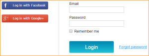
The Wild Apricot Login fields can be found bottom left. The white login fields were visible since the website opened.

The Wild Apricot Login button can be found top right of the website. Pretty easy to find due to the contrast of colors between the background and the letters of it.

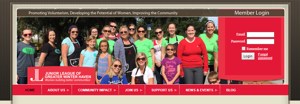
On this website the Wild Apricot Login fields are found on the top right. You can appreciate that there is a space just for the fields, u can never miss it.

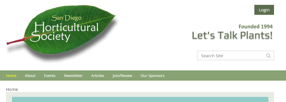
The Wild Apricot Login button is found on the top right side of the website. Is one of the first thing you notice when you come into the site, its a green button with white letters. Can’t miss it.
6- http://www.phoenixsouth.org/

The Wild Apricot Login fields are located at the bottom of the menu, the menu being on the left side of the website. It’s pretty hard to miss since the fields are white with a touch of green on the borders.

This website has its Wild Apricot Login button between the search field and the social widget tab. You can barely notice the login button since the letters are almost same color as the background and top image.
8- http://www.murdochrowing.com.au/

The Wild Apricot Login fields can be found on the top right side of the website. This one can’t be missed due to the background and the fields color, the background is white and the fields gray. Plus the login button is black.
9- https://www.georgiascienceteacher.org/

The Wild Apricot Login button on this website is located below the search field at the top right corner. In this case the login button is dark gray with the background being light gray, first thing you will notice on the website.
10- http://www.compassarts.org/

This website has its Wild Apricot Login button at the top right corner. The login button is light gray with the background being white, you could pass over it without noticing it. The login button could be blue or orange to keep the websites color composition so it will be more noticeable by members or future members.
There you have ten examples. So where are you going to position your WIld Apricot website’s login button or fields? Follow the link below for some Wild Apricot login fields and buttons examples from Nicasio Design projects.


