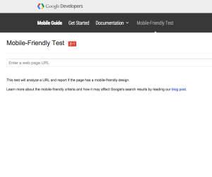
Click on the image here to see if your website pages are mobile friendly using Google’s tester…
Things to consider:
Do you see your site’s navigation being restructured in any way that would cause a new menu(s) to be created just for the mobile version(s)? Or, is your goal a basic restyling of the current menu(s) to work better on mobile devices?
Furthermore, can you express any desired changes you’d like to see with your site’s navigation? Do you have an example for the developer to follow?
Are there any elements you want to add specifically for the mobile version(s) only?
Are there any elements on your full/desktop site you don’t want present in the mobile version?
Are there any sections of your site we need to pay extra attention to in terms of layouts and design?
Visuals work best. So, if you know of any websites we can look at that will help steer your developer in the right direction of what you are looking for, share them by mentioning the website address and what elements you like or don’t like about them.
Just a few quick tips to approaching website mobile optimization from your friends here at Nicasio Design.


