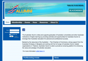
The best way to show how the before and after Wild Apricot Themes we work on for our clients – is to simply share a visual and allow it to speak for itself. This is the default Wild Apricot Themes as it looked before Nicasio Design refinement of same. Don’t get me wrong there is nothing bad about a default Wild Apricot Theme. If you had a choice, however I am certain the refined would be preferred over the default no?

Old Alumni Site has been replaced with this new refined Wild Apricot Theme. The visuals are enhanced and the brand is more prominently displayed using a clear header area background. Also more prominent and clear call to actions for site visitors. Let us know forget the social media icons as well now clearly displayed at the top of the page(s). Overall, a vast improvement from the Old to the New.
If you are in the market for an improved or even customWild Apricot Theme, let us know and we will provide a free and quick estimate. Making you look good is our number 1 goal.

