People flock towards your website.
They land on your homepage and BOOM. There’s no direction, utter confusion, and they run away.
‘The average attention span of a human being has dropped from 12 seconds in 2000 to 8 seconds in 2013.’ National Center for Biotechnology Information
8 seconds. That’s all you have to warm this traffic and convince them that they need you. To welcome them. To take their hands (virtual, of course) and guide them towards the next step, the goal of your website.
But, you’re failing miserably. You’ve done half the job great – you’re getting traffic. But your homepage is driving them away. Your website is an utter mess. Washing away all your hard work.
You’re not alone in this. According to a report by Econsultancy, a mere 22% of marketers are happy with their conversion rate.
This needs to change.
So how do you turn your homepage into a converting powerhouse, the heart of your digital empire? How do you convert traffic into loyal customers?
- Have a single strong CTA
According to a research, only 47% of websites had a clear CTA that visitors could spot within 3 seconds of landing on it.
A CTA is an integral part of your homepage. After all, you didn’t build a website for no reason. You want visitors to take an action when they land on your homepage. And that’s where a strong CTA comes in and rescues you.
Call to actions include,
- Sign up
- Work with me
- Read my Blog
- Book a discovery Call
- Join my club
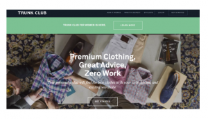
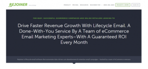
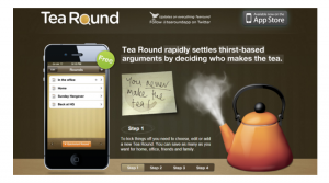
- ETC…With every extra CTA, you’re decreasing your conversion rate. Every extra CTA steers the visitor in a different direction. It confuses visitors, and digital folks do not deal well with confusion. They depart, never to show their faces again. So in order to increase conversions, you need to hold the visitors hand and lead them towards the next step. Examples of websites nailing the CTA game:
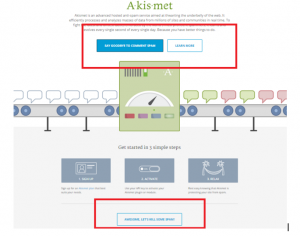
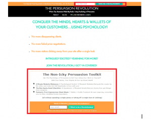
Practical Tip: Choose a single CTA. The one action that you want the visitors to take instantly. Add it once above the fold, as whopping 80% visitors spend majority of their time there, and once at the very end. This will definitely amplify conversions. And make sure your homepage copy is in line with your CTA and doesn’t distract visitors.
2. Strong headline above the fold
When casual passersby come across your website and visit your homepage they have absolutely no idea what you’re all about. And if they don’t find out how you can help them within seconds of landing on your homepage, they’re going to run away assuming that you can’t help them.
Therefore, you need a strong, compelling headline that states exactly who you are and how you can help them.
Examples of brands rocking the headline game:
Practical Tip: Short and sweet works great here. Keep it under 15 words and make it bold. Try to hit on the right pain points or desires of your target audience, and hook ‘em in with the first word.
3. Don’t be afraid to show personality
Remember that guy in a dinner party who was tedious and boring? Nobody wanted to sit next to him, and listen to his mind-numbing story full of complicated phrases that only he understood. Well, don’t turn into him.
Your homepage is your virtual office. Not everybody is fluent in your industry jargon, and frankly, boring doesn’t cut it in the digital world anymore. Talk to your visitors like you’d talk to a friend. And if you absolutely can’t, hire a copywriter who can.
Practical advice:
- Avoid industry jargon and big words. Use simple language.
- Use words that you target audience frequently use.
- Keep exclamation marks at a minimum.
4. An annoying menu
Menus in non-standard location like hidden in the body of your text are not only annoying but also greatly diminish the chance of converting visitors. They’ll look around for a menu to click on and if they don’t find it within a couple of seconds they’ll click {x}.
Practical tip: Have 4 to 6 items on your menu, and make sure it’s on the top of your website where users can easily spot it.
Your website homepage is where all the action takes place. It is the heart of your digital existence. So, optimizing your homepage should be your number one priority. Take one element at a time, and tweak it. You’ll be surprised by how a few small changes can make a huge difference to your conversions.
Guest Post By: Maham S. Chappal is a freelance content writer. She creates impossible-to-ignore content for businesses that skyrockets their online visibility. You can find her at mahamschappal.com


