You’ve done everything you possibly could to bring traffic your way. But, if your website isn’t able to hook them in and nudge them towards your CTA, then all your hard work is going down the drain.
Bounce rate higher than 50% should start ringing warning bells in your mind, because that means more than half of the traffic that visits your website clicks the {x} button right away. Disappointed, frustrated, and unconvinced.
Here are 5 reasons why your traffic isn’t sticking around to get to know you and your brand.
Slow loading time
4 seconds. That’s all you have to convince users they’re on the right website and you have everything they’re looking for. But, if your website pages takes more than 4 seconds to load, you’ve lost this chance.
So, you need a website that is super-fast. There are several tools you can use to check your website loading speed, and tweak it accordingly.
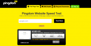
Two of the best ones are:
Irrelevant content
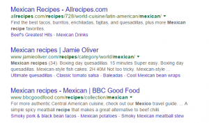
If you create an ad for Mexican recipes and provide users with Chinese recipes when they click on the ad, chances are they’re not going to stick around. They’ll feel duped. While it’s true that both of these are recipes, and a little search could have led users to the Mexican recipes page on your website, you still provided them with irrelevant content.
So, link the right landing page to your website, and make sure your ad and your content are in sync.
Bombardment of ads

Yes, ads are a great way to earn a little side income. But not when they’re intrusive and downright annoying. Imagine going to a website to read about a quick solution for your aching knees, only to have an annoying ad video start playing for 30 seconds. Will you stick around? Nope. Similarly, banner ads and pop-up ads can get annoying as well and result in lack of trust from the users. Use a limited number of ads and make sure they’re relevant to your website content.
No clear CTA
You’ve directed all this traffic to your landing page because you want them to take a certain action. But, if your call to action is not clear, you have multiple CTAs, or it’s hidden among a lot of unnecessary text and pictures, your users will never convert.
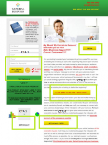
You need a single, strong CTA that is visible to users who visit your landing page.
Unattractive landing page
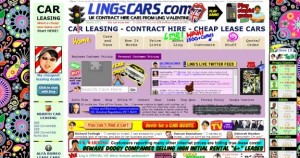
- Multiple fonts. Most of them illegible
- Too many colors. All clashing with each other.
- Heavy animation. Not adding to the value of the page, instead, distracting and annoying users.
- Multiple attention grabbing images.
All these are characteristics of a doomed landing page. Time now calls for a simple, minimalistic design that adds to customer experience.
Via Rocknrollbride
Every landing page element should be there for a reason, to send users towards the CTA. Animations, unnecessary pictures, too many fonts and colors are all going to distract users. So, keep it simple. Make your CTA and content the hero.
It’s not hard to lower down your bounce rate to 50% or even less. Just a few tweaks can make your website a user heaven. So, go on. Start fixing your bounce rates.

