Even though smartphones have gathered a tremendous amount of recognition across the globe, native applications still have their unique niche. With mobile innovation bringing an innovative breakthrough in the world of technology, the existence of numerous gadgets, operating systems and screen sizes makes the task of developing mobile optimized web applications even more exciting. So, if you too are a developer looking ahead to create a mobile-friendly website that looks and feels more like native apps, then you’re on the right post. Here, I’ve explained four simple tricks on proceeding ahead with the same in the most refined way.
Trick No.1- Utilize the concept of Momentum Scrolling
If you’re the one who’s been trying hard to create a scrollable container for your mobile website and have been annoyed due to the non-responsive scrolling, momentum scrolling is what you can try for sure. With Android 3+ and iOS 5+, you’ll find a new property called overflow-scrolling which will enable momentum scrolling for your mobile-compatible site and thereby render it a new look and feel of a native application. For this, all you need to do is simply add the below property to your scrolling containers:
-webkit-overflow-scrolling: touch;
Trick No.2- Set the overflow property for divs
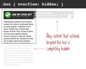
It is the ability to set the overflow property for divs which is often ignored by a lot of web designers. So, make sure to allow all such divs to be scrolled directly(either with or without scrollbars) by the touch events. For all modern browsers, you can do this by setting a css property as shown below:
.scrolldiv {
-webkit-overflow-scrolling: touch;
}
Trick No.3- Build Performant Animations
Animations play a vital role in differentiating websites from applications. Gone are the days when using Javascript-based animations turned to be slower on weaker mobile CPUs, now with enhanced mobile browser support, it has become quite convenient to use the hardware-accelerated CSS3 animations in all your mobile websites, thereby making them behave like native applications. In order to ensure that your animations feel native, it is essential for you to ensure that they aren’t slow in operation. Although achieving this is a a bit challenging, it isn’t unfeasible at all. Just make a note of the below pointers and you can get on with building native-feeling animations for your mobile website:
- Animations should move at about 60fps(frames per second)- That means, each frame within the animation should consume approximately 16 ms for completion. Here, it is interesting to note that all iOS built-in animations run at a speed of 60fps, making an iPhone/iPad experience much better as compared to Android experience.
- Apart from animations, everything else must respond in under 100ms. The activities undertaken here seem to be quite instantaneous to the end user.
- If, at all, the things have to take longer than 100ms, make sure they respond within 100ms. It is recommended that every element5 which consumes more than 100ms to complete must give the user some sort of indication regarding the occurrence of an event. A good example is the spinner or progress bar.
- If something takes longer than a single second, then it’s time to worry
Animation timing has and will continue to remain a key point of concern among developers building for the web. Hence, if your animation is taking more than one second to complete, then you need to take special measures for bringing the animation timing on track.
Trick No.4- Equip your buttons with touch states
Tapping on a website typically takes around 300ms for the visitor to be able to view an activity on the web page. This is something that can terribly influence the user experience. A viable solution for this is to make your buttons respond immediately to the user’s touch. Doing this would render a great visual indication of something that is happening on the web page. Active state is an excellent web property that can be used for showcasing when a particular link of button is clicked. Therefore, you can opt for enabling this active state by simply adding an event to your web page using Javascript as shown below:
document.addEventListener(“touchstart”, function(){}, true)
After this, you can use CSS for adding active states to your buttons. For this, simply remove the highlight as shown below:
-webkit-tap-highlight-color: rgba(0,0,0,0);
With the active states being set on your buttons, you can make your buttons respond much faster.
That’s it!
Conclusion
If you’re the one who’s been struggling hard to eliminate that thin line of difference between your mobile website and native application, then this is a blog which will definitely serve as a great sigh of relief.
Author Bio –
 Victoria Brinsley is a skilled Android developer for Appsted Ltd – a leading mobile app development company. With her best assistance, you can get explore more about the development lessons, tips and tricks.


